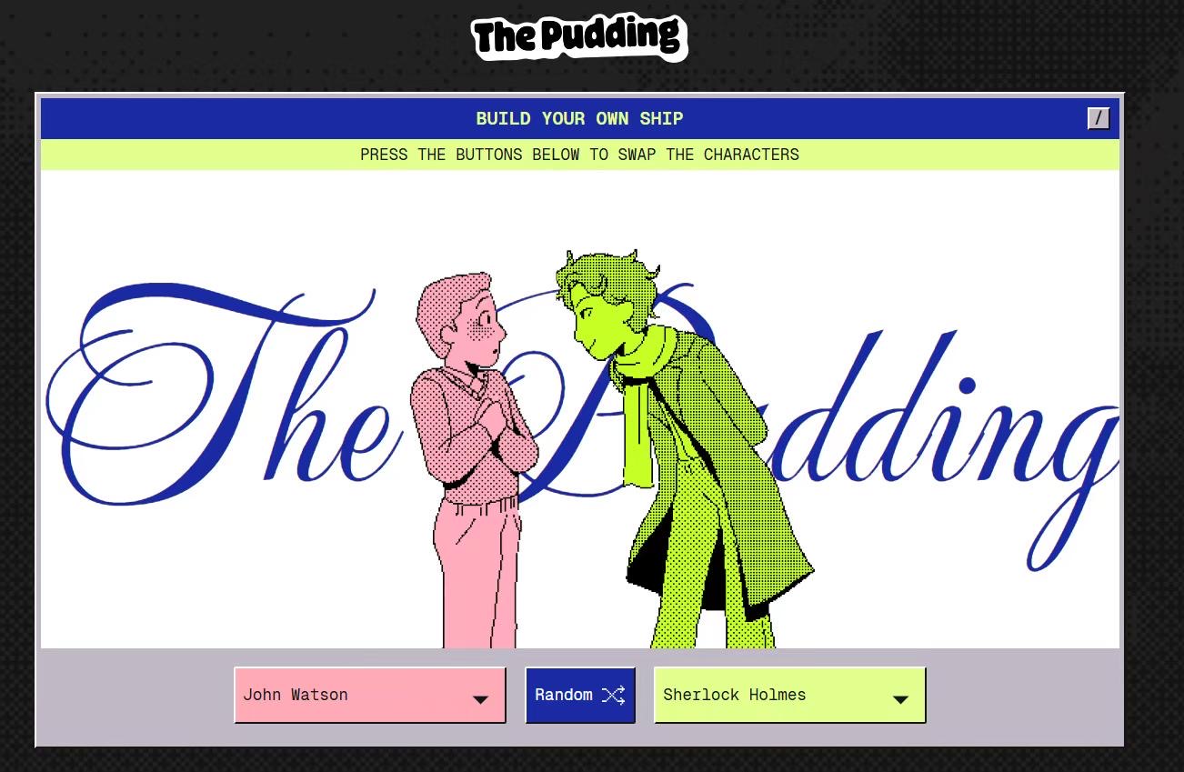
Last week, I wrote a piece on my personal webpage about “redesigning the AO3 interface to improve readability” (which my roommate teased me about for being too nerdy). This week, Holly recommended the Pudding data visualization piece Who Gets Shipped and Why? as part of our workshop prep, and honestly, I was blown away. Why do people create such incredible things?! 😱
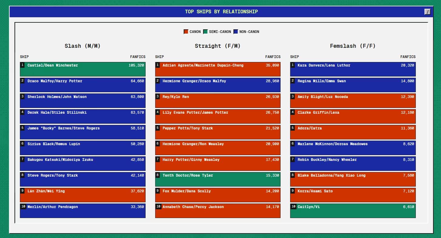
The work dives into fanart culture and explores why people are often more invested in transformative works than in canon content. Using data from AO3 (a site I've spent way too much time on), the authors analyzed popular trends in fanfiction, particularly focusing on the dominance of certain pairings in U.S.-produced media. Their findings were fascinating:
One particularly interesting insight was the demographic behind M/M pairings. The study showed that these pairings are often supported by cisgender women, while the characters imagined are frequently white, heterosexual men.
The piece also touched on the tension between freedom and limitation in fanart culture. On the one hand, fans have the agency to create their own narratives and explore stories in ways that the original material never intended—“as if it were a tangible place they can inhabit and explore.” On the other hand, the choices fans make are often trapped within a feedback loop: mainstream media favors certain archetypes, which shapes fan engagement and preferences, and in turn reinforces the same archetypes back into mainstream media. This explains why, in fanart data, ships involving people of color or F/F (female/female) pairings are far less common than those featuring white M/M pairings.
I found this analysis not only incredibly insightful but also deeply reflective of how media and fan cultures influence each other. It made me wonder how we might intentionally disrupt this feedback loop to create space for more diverse representations—not just in media but in the fandoms that surround them.

In this week's workshop, we explored the ideological work of data visualization and how design can shape narratives and insights derived from data. This topic resonated with me deeply, as I have experience creating a data visualization project titled *"A Necessity of Half the Population: Should it be Taxed?”*. This project analyzed global taxation on menstrual products, using a combination of statistical analysis and visual storytelling to highlight inequality and advocate for change.
Through the readings and discussions, I realized that data visualization is not just about aesthetics or presenting raw numbers. It involves an interplay between the message, the audience, and the medium. For example, in my previous project, I aimed to balance clarity and engagement by:
Kenny and Hill (2016) emphasize that while data visualization is an increasingly popular method for communicating research, its creation involves significant complexity and critical challenges. My previous project, though visually clear, highlights some of these complexities and areas for improvement.
For example, the framing of the visualization—focusing specifically on tax rates for menstrual products—reflects an ideological standpoint: that taxing such essential items is unjust. While this perspective aligns with advocacy for gender equity, it might not be apparent to viewers unfamiliar with the broader context of tax policies or global gender inequality.
Ultimately, I believe data visualization is a powerful medium for amplifying marginalized voices and advancing social justice, as Kenny and Hill supposed, “Visualization can be used for advocacy and social justice purposes, empowering individuals and communities to challenge data power structures.”